Product Redesign
Benchmark Email
SaaS
//
Marketing App
Start from Scratch
As Benchmark’s flagship product grew, its foundational technology struggled to scale. Obsolete code limited the company's product offering, couldn't meet customer needs and slowed down internal processes.
In the best interest of customers and the company’s future, we fully rebuilt Benchmark’s email marketing web app, releasing it January 2018.

Mobile screens after Benchmark's redesign
My Role
I worked alongside the Director of Design, a team of developers, and stakeholders to fully reimagine the web app’s interface while migrating its backend to newly developed APIs.
As a team lead, I helped execute end-to-end operations, drove alignment, and shared responsibilities including research, wireframes, prototypes, UI/UX design, and overall product strategy. Aiming to improve team processes as well, we created a new design system and improved transparency with direct feedback loops and product metric access.
Challenges
Each team member wore multiple hats, dealing with up-hill challenges in both product and business sides.
Limited Data
Reliable data wasn't very accessible for Benchmark's legacy app. Acquiring where we could, we sifted through customer reported issues, reached out to our customer support team and tried getting early insights with user testing. With limited data and a tight timeline, we knew we were seeing a small, fragmented piece of a story, but made informed decisions as best as we could.

User testing prototypes used to gather early insights
Change Aversion
Considering new and existing customers, we knew the transition would be hard for a group of loyal customers and wanted to be empathetic and mindful that change is hard and disruptive. We wanted to minimize this as much as possible, keeping workflows familiar, reducing existing friction and giving guidance in contextual areas.
Time Constraints
Time was not on our side. As a small team, we couldn't be away from the existing product for an extended period of time. We continuously discussed quality, time and resources, balancing where to invest in the company's future.
Business Risk
Even with a consensus that the legacy product couldn’t be sustained, the reality was that this project was a high risk that directly impacted company revenue. We could potentially lose a lot of clients in one or many regions around the world. It was important to have continuous stakeholder dialogue to weigh trade-offs, define a clear scope and create execution strategies to give the company padding to pivot.

Cost-Benefit
Customer Struggles
As our team set out to gain deeper understanding about friction points and what customers were trying to do in the legacy app, we found reoccurring patterns.
Confusing UI
Hierarchy and navigation issues persisted throughout the app. Everything was equally important, so nothing was important. The navigation had too many ways to get to a single location, hidden links, looping paths and redundant options that made it unclear how customers should move throughout the app.

Equal importance on Benchmark's legacy dashboard

Redundant navigation with poor hierarchy
Everything Felt Slow
Without a modern framework, every page in the app was handled manually and lacked visual feedback cues. Customers grew frustrated waiting for pages to load and then again with every save action. This was worse in regions with slower connectivity.

Painful loading times
The UI inconvenienced customers and made workflows difficult. Interactions didn’t feel very good.

Inconvenient UI patterns
Disjointed Experience
Benchmark’s legacy app was riddled with technical debt, resulting in a disjointed experience for customers. We'd hear questions like "Why can I do this here, but not here? Don't they do the same thing?" repeatedly.
Fueled by different technologies, inconsistent components and unpredictable behaviors, it was apparent that the design debt was negatively impacting the customer experience. We found out quickly which tools customers trusted and which they didn’t.

Design debt created experience inconsistencies
Solving Issues
Based on customer struggles and company vision, we identified project goals and issues we could to solve during the ambitious rebuild.
Replaced Unforgiving Workflows with Streamlined Patterns
With top workflows in mind, we removed distracting and alternative paths to provide clear direction. We then used scaleable components to create smoother interactions and repeated patterns that helped customers flow through the app more efficiently.


Unified patterns to increase flexibility and workflow efficiency
Removed the Guesswork
We aimed to remove extra barriers from getting the job done by unifying behaviors, improving conditional messages, updating inaccurate information and adding personalized modules. We made the interface more transparent so customers would build trust and know what to expect.

New modules personalized to each customer

Better conditional messages for our customers and the business
Unified and Expanded the Experience
As we unified the overall app, we also expanded compatibility with more device sizes and improved the experience in other supported languages. In creating a responsive app with scaleable components, we were able to increase the quality and value delivered across growing regions.

Improved experience on more devices and in other supported languages
Added Data & Feedback Loops
Building the app from scratch gave us an opportunity to implement ways to gather data that product teams could directly access for future decisions. It also allowed us to start testing onboarding strategies and putting in feedback loops to hear directly from our customers in app, which had never been done before.

Contextual feedback module
New Design System
Knowing the product needed to scale, we built the app with atomic design components and created a design system that multiple teams could own, utilize, and continue to develop. In 2019, components were made visible in Storybook, a component based ui library, to further unify the ownership between designers and developers.

Sample of design system housed in Storybook
Measuring Impact
Launched within 9 months, the app redesign resulted in both short and long term impacts for customers, R&D department, and the company.
Increased Product Value
The app’s redesign increased the product value during merger negotiations that occurred the following year, allowing Benchmark founders to retain 75% ownership of the company.
Improved Usability
By focusing on usability and customer needs, revenue continued to steadily increase and was reflected in positive customer feedback received through direct feedback loops and customer support channels.
Very clear and precise layout now, easy to click on the tabs of main importance. Saves time searching through the relevant information. Clear and fresh look keeps it simple and easy to navigate. No fuss! Greatly improved.
Rachel Scanlan
//
Feb 2018
Really love the new UI/UX, a big step up from the previous interface. Great job guys!!
Eric Lee
//
Mar 2018
Better Team Efficiency & App Performance
By creating a new design system, we unified the app experience, boosted team efficiency, reduced time-to-market, and set a precedent for shared ownership. Through modern UI/UX practices and decoupling from obsolete code, we also reduced the product's footprint by 29%.
Additionally, we introduced analytic software into the product for the first time in its history. In doing so, we opened transparency and empowered cross-functional teams to make data-informed decisions, which established departmental practices that were later adopted by the greater company.

Report modules from the app
What Would We Have Done Differently?
By executing the rollout in strategic waves, we were able to learn, prioritize, and iterate quickly against missed opportunities.
Further Navigation Investigation
Though we conducted early navigation tests with small sample groups, post launch revealed that existing customers thought tools had been removed because the navigation looked cleaner on desktop. To address this, we used data to give us insight and execute navigation improvements.


Iterated desktop navigation based on customer feedback.
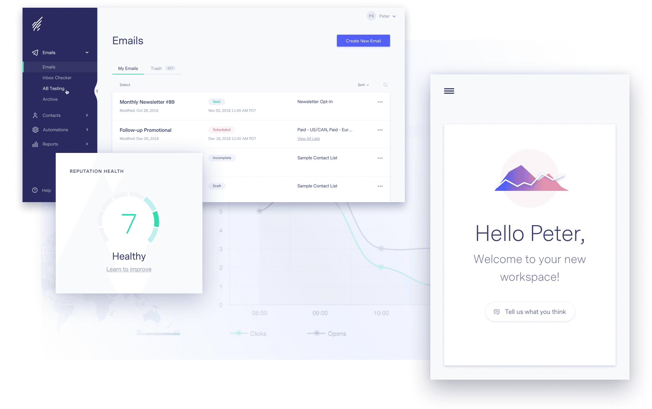
Reprioritizing Onboarding
In building an onboarding experiences for the first time in the app’s history, we established a base line to measure against. In hindsight, it also helped us identify missed opportunities and the importance of first impressions. Shortly after initial release, we prioritized improving the experience.

Screens from the welcome experience for existing customers
Focus On Accessibility
Because the legacy app had limited accessibility compliance, we built the redesigned site with improvements such as larger typography and keyboard alternatives for mouseover actions. After launch, we took more time to make sure color contrast met standards and improved readability for asian languages where characters had smaller x-heights.

Readability differences between the latin alphabet and asian character sets